Saturday, October 20, 2007

Objective Evaluation of Seam Carving

Recently, I've blogged on some experiments I've done to investigate the seam carving algorithm. In particular, I wanted to test the algorithm against some real-world images with different reduction factors. The idea was to find in which conditions the algorithm performed best and in which it performed worst, and although I used a specific implementation, the gimp plug-in developed by Carlo Bassaldi, on the images, I did run a few of these images through other implementations (especifically, Andy Owen's implementation and a Java one) to verify the results (they gave the same result).

Wolfger has also blogged on the algorithm, later giving an update stating that the gimp plug-in seemed to be worthless. Since I used the plug-in a lot and found it quite useful, I left a comment stating that, in my opinion, the plug-in was not worthless, to which he answered

"The horse pic on your site demonstrates why I called the Gimp plugin worthless."
and finished saying
"So it’s far less useful than it ought to be. Can we agree on that?".
Well, no, I'm afraid we can't agree on that since the plug-in does allow to preserve important areas in the image, as I've shown later in the blog for the same image he mentioned. I guess he didn't make to the end of the blog, although on his defense I must say the post was a long, albeit (in my opinion) interesting, one, and you had to have more than a fleeting interest on the algorithm to read it all.

For the mark, I'd like to reiterate that the gimp plug-in is not only NOT worthless, but in fact it is one of the best implementations of seam carving out there that I've tried, both in performace and in flexibility. It's also very easy to use, especially if you have some basic knowledge on gimp.

As I said, the whole point in my previous blog was to explore the strengths and weaknesses of the algorithm itself, not of any implementation in particular. The conclusion I've arrived is that the algorithm is somewhat limited for most images, especially those with persons and animals, if done without assistance. By that I mean if you just run the algorithm on an image without marking down areas to be preserved (like human shapes) or areas to be removed prioritarily.

If, on the other hand, you take the time to give hints to the algorithm, you can get quite good results, although it may take more than one try, and it may depend on the image itself. This can be seen not only in the many sites throught the web, but also from the landscape image with a horse in the foreground shown in the previous blog entry.

You can see how different are the results by the images below, taken from the previous blog. At the left we have the original image, in the middle the one processed without any preserved area, and the last protecting the horse against any seam carving.

Original Image.
Seam carving with no protective mask applied.
Seam carving with a protective mask around the horse applied.
It's easily seen how much difference our interaction made to the end result. Using a protective mask for the horse actually ensures no seam which goes through the horse is removed, which guarantees the horse's shape in unaltered.

Why is this issue important? Because it makes automatic image processing with seam carving more difficult, not to mention applying it to video processing, as some have already considered. It is not that it is impossible to do a good job, but it certainly is far from trivial. And having a good notion of when and how seam carving can give good results is essential for someone deciding what is the best algorithm to apply in any circunstance. To ignore it makes anyone susceptible of easily falling for sweet talk.

Labels: ,

Friday, September 21, 2007

Implementations of the Seam Carving Algorithm

Since I first started blogging about this technique, several implementations have been popping up, so I decided to make a list of them. Some of them are web-based (mostly in flash), others are plug-ins to another software, and still others are stand-alone applications. Here they are:

Web-based

  • Patrick Swieskowski has a Seam Carving Demo which allows you to try it on any photo on the web.
  • There is another flash implementation in je2050.de which does a pretty good job. Unfortunately it is restricted to two pictures only.
  • Zero point nine has its own flash implementation, too
Plug-ins Stand-alone Others
  • Hector Yee has implemented in flash, too, but is not on-line
Update: Tim Wintle has told me he also has an implementation of seam carving in python here. I haven't tested as it is a binary-only program for Windows.

Labels: ,

Thursday, September 20, 2007

Experiments on Seam Carving

OK, I admit. I was really curious about the technique named seam carving, which I've blogged before, and which has received a fair amount of attention on the net recently. I then decided to explore it a bit more using the gimp plug-in (BTW, kudos to Carlo Baldassi for this plug-in, I'll write more about it later). So, I've chosen a few representative images and ran the implementation on them in order to evaluate in what conditions the algorithm performed ok and when it failed. The rest of this blog details these experiments.

A Reference Image

Before checking the algorithm on real pictures, I've decided to test it on the following somewhat artificial image to better check for its effects on image features:

Gradient picture
A Reference Picture With a 1024 Pixels Width

As can be seen, the image, which has a width of 1024 pixels, consists of two subjects, an apple and grapes, with a gradient background behind them. Why the gradient background? Well, since for this image the seam carving algorithm is going to be applied on its width, and hence it will run roughly over the vertical columns of pixels, we should get approximately the same results as for a plain background. On the other hand, any distortion caused by the carving will be readily apparent, due to distortion on the gradient itself.

Just for the sake of comparison, I've scaled the width down to 640 pixels, which gives a little less than 40% reduction, and the result is shown below. As can be seen, distortion is evident throughout the scaled-down image.

Gradient scaled down
Scaled Down Version of Reference Picture

Applying the seam carving algorithm on the reference image to reduce it to a 640-pixel width gives the result below. Comparing it with the previous scaled-down image, we can immediately see the gains the algorithm gives. Although distortion is visible in the gradient background, the apple and the grapes keep their original shapes.
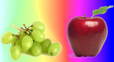
Gradient picture with seam carving at 640 pixels
Reducing Reference Picture to 640 pixel-width With Seam Carving

We also reduced the image further to a 480 pixel width (a reduction of more than 50%), as shown below. In this case, the fruits start to present some distortion, but this is unavoidable seeing that they are already packed against each other.

Gradient picture with seam carving at 480 pixels
Reducing Reference Picture to 480 pixel-width With Seam Carving

From these pictures we see that the algorithm performs reasonably well when applied to an image with an homogeneous background. Let's check now for more interesting images.

Selected Images

For real-world images, five images were chosen (two landscapes, two with people and one geometric) having features that are representative of most pictures, like human and animal figures, geometric shapes and loosely-constrained shapes (like trees, mountains, grass fields and clouds, whose shapes can vary significantly and still look ok). The images were reduced to 75% and 50% of their original size using seam carving in both width and height (separately).

The first landscape image is a picture of a small village in a valley.

First Landscape Picture - A Valley
Here we see that the image contains a detailed bottom half and a more homogeneous upper half. Besides, none of the elements in the picture are too constrained on their shapes. We then applied the algorithm on this image, getting the results below. As I said in my previous post, the processing time for 1024x800 pixels images are in the order of 15 - 20 seconds. This one, being a little smaller (680x500), took less than 10 seconds.
Applying Seam Carving at 75% on Width
Applying Seam Carving at 75% on Height
Applying Seam Carving at 50% on Width
Applying Seam Carving at 50% on Height

From the above images we see that the algorithm performs reasonably well at both reduction rates and in both directions (width and height). So far, so good.

The next image is a landscape picture with a horse in the middleground.

Horse at a Grass Field
Applying Seam Carving at 75% on Width
Applying Seam Carving at 75% on Height
Applying Seam Carving at 50% on Width
Applying Seam Carving at 50% on Height

The situation here is a little different. The algorithm has problems even at the lower scaling rate, since the horse is significantly distorted in all cases, even though the rest of the picture looks ok. That may be partly due to the patterns for the grass and the clouds having more details than for the horse, but it is also because any change in the shape of the horse is much more noticeable than for the other elements in the picture. This effect can be seen not only here but in the next pictures, too.

Another problematic picture is the one below with a man silhouette in the center of the image.

Silhoueted Man

This is a rather interesting picture because of its lack of details, both in the man as in the other parts of the picture. Running the algorithm on it gives the following images:

Applying Seam Carving at 75% on Width
Applying Seam Carving at 75% on Height
Applying Seam Carving at 50% on Width
Applying Seam Carving at 50% on Height

We can see that only the least reduced-height picture is really acceptable, since it is the only one where the man is not significantly distorted. Again, it may partly due to the lack of details in the man texture, but also is due to more stringent criteria for the human shape.

The fourth picture also has human figures in it, in this case, two children.

Children at the Beach

It's worth noticing that the children are well-lit and have good details, unlike the silhoutted man in the previous image. Applying the algorithm gives the images below.

Applying Seam Carving at 75% on Width
Applying Seam Carving at 75% on Height
Applying Seam Carving at 50% on Width
Applying Seam Carving at 50% on Height

We can see that, even though the algorithm performs a little better, the higher-compressed images are still problematic.

The last image is a picture of a part of the Golden Gate, in San Francisco, and as such is strongly geometric.

Golden Gate

Although the picture doesn't have a lot of detailed patterns, it has lots of straight lines. Applying then the algorithm gives the following results:

Applying Seam Carving at 75% on Height
Applying Seam Carving at 50% on Width
Applying Seam Carving at 50% on Height

We can see that in none of the cases the algorithm performs satisfactorily. Hector Yee in his blog reported finding problems with geometric shapes, too. Interestingly, he tried a modified algorithm which chooses the seam to be removed in a more stochastically way found that it apparently gave better results. Since I didn't have access to the modified algorithm, I couldn't test with the above image, but in some way it makes sense, since removing seams more or less randomly may give straighter lines.

The Gimp Plug-in

The gimp plug-in has a feature where one can define a region of the image to be (mostly) preserved from the operations of the algorithm. We used this feature to re-run the algorithm for the second and third pictures, preserving the areas around the horse and the man, respcectively. The results for the 50% reduction cases are shown below.

Applying Seam Carving at 50% on Width Preserving Horse Shape
Applying Seam Carving at 50% on Width Preserving Human Shape
It can be readily seen that the results have improved very significantly, with both the man and the horse shapes preserved (as they should), while the rest of the picture with the same good results as before. We can conclude that seam carving, as implemented by the gimp plug-in, does a good job in scaling down images with "generic" shapes, like trees and mountains, which are present in most landscape pictures. It has, however, problems with pictures with more constrained shapes, like human and animal shapes. These problems can be, though, substantially improved by protecting the sensitive parts manually before applying the algorithm. On the other hand, images with strong geometric shapes are not suitable in general for the seam carving algoritm.

Conclusions

I'd be most interested in hearing comments on the finding of other implementations.

Labels: ,

Wednesday, September 19, 2007

Seam Carving - The Sequel

There seems to be a flurry of activity over the algorithm developed by a couple of Israeli researchers on resizing an image with minimum loss. I've written a blog on it a couple of days ago, noting the interesting results they got based on a video available on YouTube.

People were fast to implement the algorithm on flash. I've found already four versions, one by Patrick Swieskowski, another by joa, still another by Hector Yee and finally one by zero point nine. There is also a plug-in for Gimp (very cool, BTW) amd an implementation in python (no source code yet, though). As expected, the algorithm demands some computing processing but not that much. I've clocked the gimp plug-in performing a reduction on the width of an image from 1024 pixels down to 640 between 15 to 20 seconds. The flash version is slower, but still workable. With these implementations one can play a bit with different images.

The one by Patrick Swieskowski can be fed any image, something important to try out different subjects. In his blog he points out that "It's a little tricky to find photos that can be resized by a large amount with cool results". The second implementation has pretty good results with the images they've chosen (the second image is here). Hector Yee makes an interesting comment where he also tried implementing the algorithm choosing randomly the next seam to be carved, and got somewhat better results for images more geometric.

Well, then, how does it fare in the real world? Not that bad, would be the answer, but some images are better than others. The algorithm performs best for those images that have homogeneous expanses, like sky, water and snow, where it can unnoticeably suppress those expanses (or expand them) without affecting more interesting details (like a human shape). As soon the image becomes a little more complex, though, the algorithm may disturb important portions of the image. This can be seen from the first demo above, where the tree (arguably the main subject in the picture) gets purged from the photography when we try to reduce its height by more than approximately 40% (at 50% reduction it no longer draws any attention). Still, the algorithm does a good job below that level, and maybe, with a little hint of our part on the importance of the tree, it can squeeze it further keeping a good job. Also, if the subjects in the image are not that familiar (many landscape images are like that) then the processing gives better results.

On the other hand, for some images, especially those more geometric, the algorithm may perform poorly. You can see that with the following two images:


For those, the algorithm seems to disturb the image faster and more noticeably. But maybe folks are going to improve it. We'll see.

I'll post laster some experiments I did with the gimp plug-in.

Labels: ,

Tuesday, September 18, 2007

Creativity (or the lack of)

Searching the web for information on outline and brainstorm editors (something that I'll write about later when I consolidate my ideas on them), I found a web site that does a relatively good job in reviewing several "organizers applications" (although the applications themselves are not that interesting). But better than the reviews (and surely the reviewed applications) is a link to a web site dedicated to Creativity. That link is dead but curious about the site I looked at the WayBack Machine, and surely the site was there (apparently it went dead by the end of 2004). Having checked, and approved of, its contents, I went to Google to try and find if the site had moved somewhere else, and indeed it had. Excellent! But Google didn't return just that site. I had searched for a complete phrase from the original site to make sure I found an exact copy, and an exact copy I found. Actually, something more like twenty copies! Upon looking more closely, I saw that most of them (if not all), with the exception of the "true" one, took the article from the site and "borrowed" it, publishing it themselves giving no credits to the original author, with one exception (and even this one points back to the dead site). Kinda ironic an article on creativity be "used" in the least creative way, isn't it? And many of them are personal blogs, passing the articles as if it were their ideas!

Nonetheless, the article is short and to the point, well worth reading.

Oh, and two of the xeroed blogs are here and here.

Monday, September 17, 2007

Seam Carving

I stumbled upon a video today that shows an amazing image processing tool that allows for rescaling an image with minimum distortion. By minimum distortion I mean the main features are preserved by the operation, whereas more redundant parts are suppressed (or augmented) to make for the size difference. This is best illustrated by two still frames from the video:

First Snapshot Second Snapshot

In both still frames you can see the original image on the upper right of the frames, and its scaled versions on the lower left. Note that the two persons in the image keep their apparent sizes and shapes. The video has many more examples.

This is a pretty interesting image manipulation. I wonder, though, how much computing processing power and memory you need for these operations?

Labels: ,

Tuesday, September 04, 2007

The overflow attribute

You know those web sites where the text in a menu or a side column spills out from the space it's supposed to be and overlaps the main content or some other menu of the web page? Isn't it annoying? Surely that was not the web designer's intention. Maybe the designer considered only one browser and didn't really test the web page with another. Or maybe the user has selected a different text size, which made text larger than intended. Whatever the reason, it is a unnecessary problem, especially because there is an work-around for it.

The CSS (from Cascading Style Sheet) standard has the overflow style attribute, which can be used in almost any tag, which controls how to display the content of the tag in case it is larger than the visual area allocated for it. For the problem above, the value for this attribute that interest us is overflow: hidden. By specifying it in the corresponding CSS selector, the designer can ensure that
the text or link or image in that tag will not overflow its area and disturb other contents.

It's certainly a big advantage for a very small price.

Labels: ,

eXTReMe Tracker